
Student logo of peer: Crystal Sigety

Visual Design Brief (Word Doc)
Research Brief for Project 3 (Infographic)
- Title: “Let’s Talk About Sex(ually Transmitted Diseases), Baby” Tagline: STIs not only carry around infection but also incorrect and false assumptions as to how and why they are transmitted and safe ways for treatment.
- Context: STIs are continually a hot topic in today’s society, especially with youth and the immense ‘incorrect knowledge’ that occurs on the internet. STIs are on the rise and continue to spike up due to unknown and misinterpreted knowledge about the STIs. There are a lot of myths about STIs that need to be resolved and resources provided easily for the viewer to access for info and possible help.
- Problem Indentification: What is an STI and the ways in which to prevent, educate, and treat STIs? I will address sterotypes and myths within my infographic that will correctly address STIs and way to prevent and treat them.
- Objectives: Purpose – To educate and advocate for safe sex practice, STI awareness, and a personal sense of reclaim to ones’ own sexual being/health. I want to viewer to have a sense of control and power over not only their own body but their sex life and health.
- Pragmatic Issues: https://www.bing.com/images/search?view=detailV2&id=C6643EBC4CB531C82453486112D4D826D52A95D0&thid=OIP.yqoOQLGboBYggOFiQ0RDXwHaJl&mediaurl=https%3A%2F%2Fwww.cdc.gov%2Fstd%2Fproducts%2Finfographics%2Fimages%2FYouth-STI-Infographic_620.jpg&exph=802&expw=620&q=std+infographics&selectedindex=6&ajaxhist=0&vt=0&ccid=yqoOQLGb&simid=607999511918480593 – This link is one that I gratly draw inspiration from. There seems to not be an exact infographic on a general Top STI fact sheet with treatment and myths all in one poster.
The Marketing of No Marketing – Reading Response
First off, I had never thought of PBR (Pabst Blue Ribbon) so much until reading this article. Secondly, once read, the sort of culture and ‘no-ad’ allurement that PBR has set for itself I believe totally reflects the majority of middle-class people’s enjoyment and satisfaction. I find it interesting that while they steadily grew on patrons of bike-messengers and tattoo enthusiast alike, they kept with their “under-dog” influence when they refused offers from high-profile musicians like Kid Rock.
The Iron laws of the American Marketplace about any trend with commercial implications are subjected to swarms of consultants, marketers, and journalists and the efforts to try to prolong the trend while the third law of cultural trends is backlash. I find that the last iron law to be the most interesting aspect because I do see trends that have rose to such appreciation only to be completely blacklisted once a tactic of marketing or representation has gone askew. PBR sets to promote an ad-free tactic and to advertise without the “advertising” happening. It seems a bit tricky to wrap ones’ mind around it, but this in turn attracts the majority of people who absolutely hate main stream advertising strategies. PBR’s mission was to appear to do as little as possible, or in other words, the artistically known facts often overlooked: the less is often the better. PBR strives to avoid the ‘high-brow’ and snobs that only the upper small class enjoys, and instead to allow a brand that doesn’t shovel ungodly amounts of ads down the throats of their followers, and instead take the scenic route when endorsing certain ‘underdog’ musicians and local bands.
There is also the worry of a brand that is the underdog -hipster- of its time to eventually sell out and become so popular that the ‘backlash’ occurs. However, I feel that almost all companies at one point become a sellout due to the immense popularity that happens with these brands- especially beer and liquor brands. Even with PBR’s elimination of jobs, as the article points out, it doesn’t seem to affect the people who drink PBR. Regardless, it was an interesting article to read about how one company, PBR, advertises without the actual “adverting” of its beer product.
Portrait Exercise

Project 2: Design Brief
- Current news Headline: Meet World’s First LGBTQ Mariachi
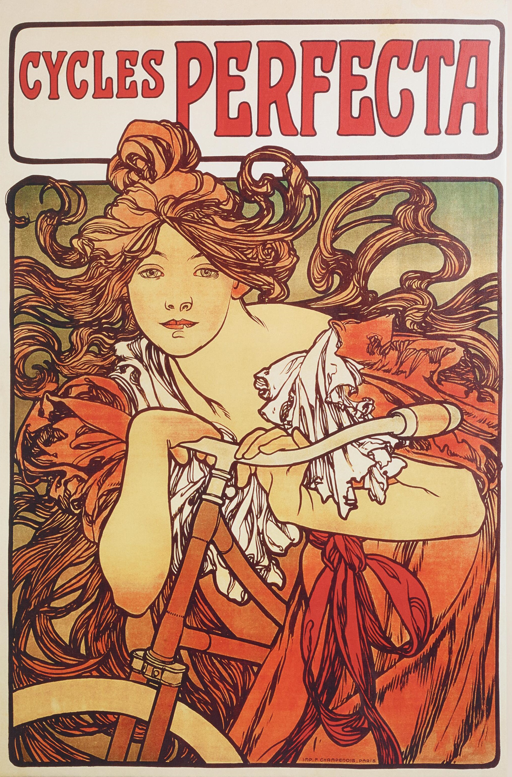
- Alphonse Mucha: Czech painter and illustrator. Had a great singing ability but pursued art.
- The visual elements within the designer’s work is super intricate and lots of curvature. Apart and defined to have embodied the Art Nouveau period. His distinct look was highly feminine and colors were often soft palettes. Best known for stylized theatrical posters of Sarah Bernhardt.
- Relevant themes of Mucha was mostly commercial art and posters, often depicting females. Women in lavish backgrounds with usually their hair in intricate curves and arabesques. Mucha was heavily involved with theater, music, and the arts in general.
- Connections made with news headline and designer is how the Mariachi is a type of music that is also very colorful like Mucha’s works. The decorative uniforms and clothing that a usual Mariachi band wears could be connected to the intricate line work of Mucha. Also conceptually Mucha’s inclination to music seems to line up with the music of Mariachi.

Exercise: 3 Road Sign Red Light District
Project 1 – Jack & Jill
Reading from the textbook: Framing, Hierarchy, Layers (116-139)
The reading provided such clarity to myself and the exact definitions of basic (yet helpful) graphic design/ basic media design lingo. The Framing chapter was simple yet helpful in understanding the exact definitions of the functions of a frame. It is interesting how the technique of cropping can control how and what the viewer may see and interpret. I appreciated the difference between a Full Bleed and a Partial Bleed. My question to that would be where would one see the use of a partial bleed in the world- judging by the example given in the textbook, the partial bleed looks like a polaroid.
The chapter about Hierarchy seemed like the most difficult to understand through the lens of a more broad scope because hierarchy bleeds throughout our social, artistic, and other aspects of life. There really isn’t a part of ones’ life that doesn’t have some sort of hierarchy. I think it would be interesting to do an exercise like the one in the textbook called “Architecture of Snacks”, it would be interesting to redo certain name brand foods and design them into a different context.
The chapter regarding Layers, I had never given thought to how process-demanding layering can be when working in layers physically. Each color required its own plate and process and then the layering had to be precise enough to align with the other plates. This is easily transferrable to the digital world like Photoshop and Illustrator. I hope to explore the layers and see how layers work within these programs in the Digital Media class. I also think that the Typographic Layer exercise would be a good exercise to do in class.
